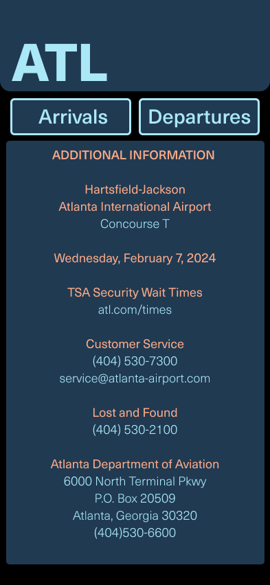


Tasked with designing a timetables application for the Atlanta International Airport. The desired result of the design was a design that is professional and appealing to the eyes, easy to read, and able to guide the reader to their designated area on time without confusion.
REASEARCH
The first action taken was researching real world examples of airport timetables. This information was used to influence the way that I designed my application.
HIERARCHY
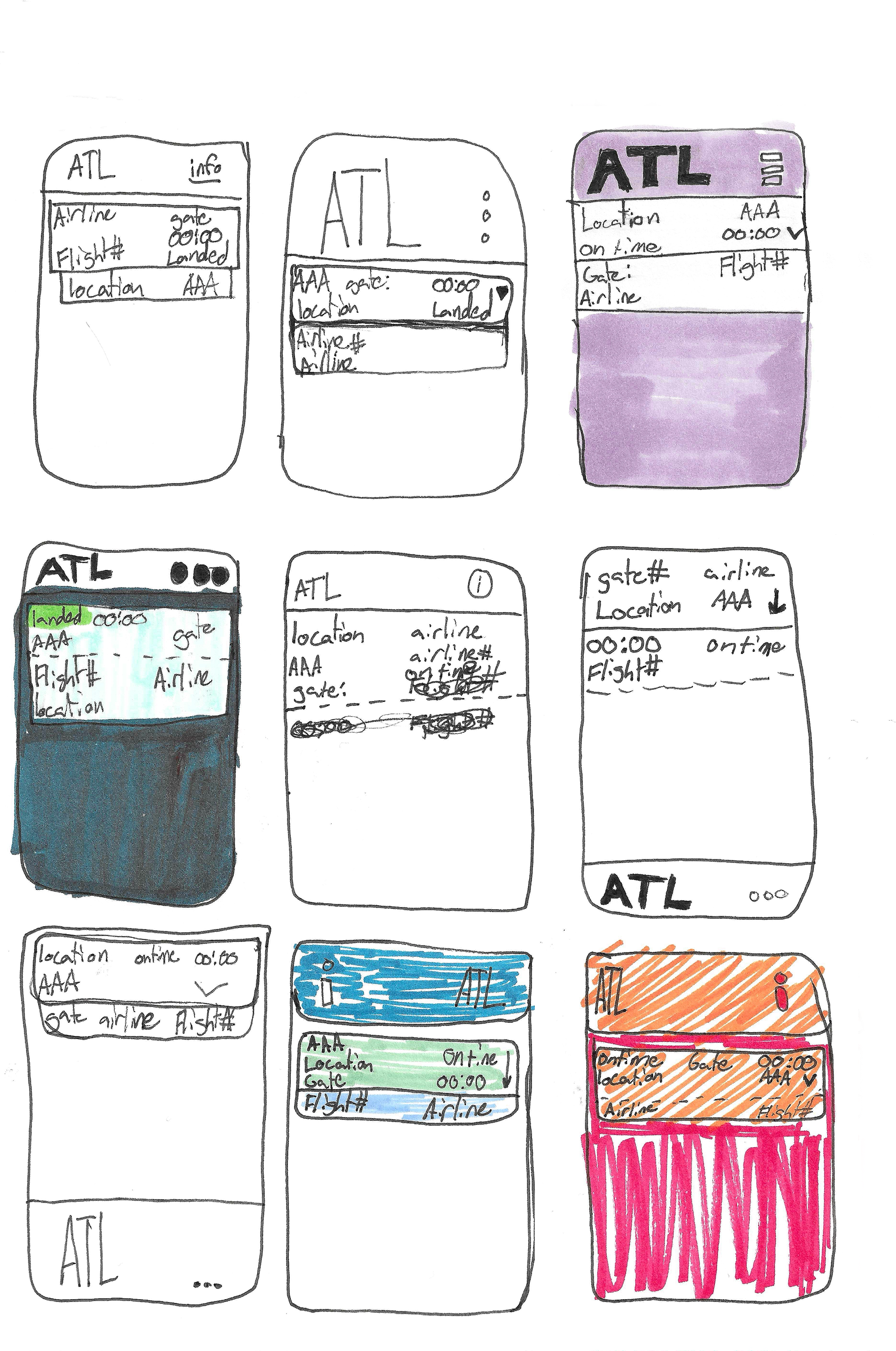
Performed a sprint to decide the best hierarchy.
SKETCHING
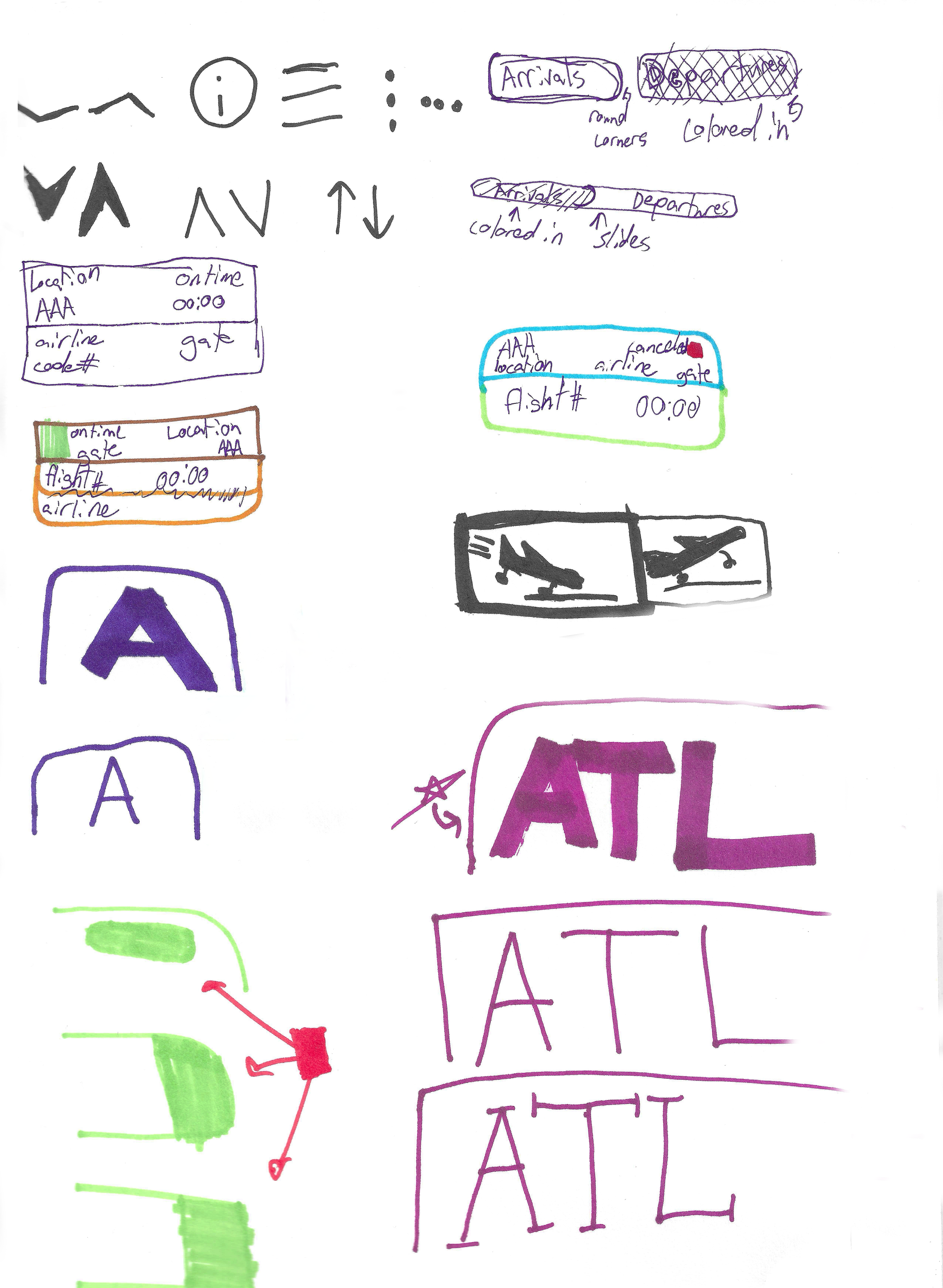
Ideated layouts and interface parts. Tested different text sizes and weights. Tested colors and grid layouts as well as button symbols and designs.


COLOR EXPLORATION
Explored color pallets. Created a palate that showed a level of professionalism, while also being inviting.
FORM EXPLORATION
Looked for logos and buttons to use from The Noun Project. Wanted simplicity, and cohesiveness between these designs.
DESIGN SYSTEM
Created a proper design system. Used colors that contrasted and are visibly different for those with color blindness but still fit with the theme of the sky. Used rounded edges on all my boxes to give a friendly atmosphere, and symbols that were simple and understandable.
ITERATION
Iterated with placement of information, text size, and color. Ensured that the design was cohesive, concise, and understandable.
FINAL
CREDITS


